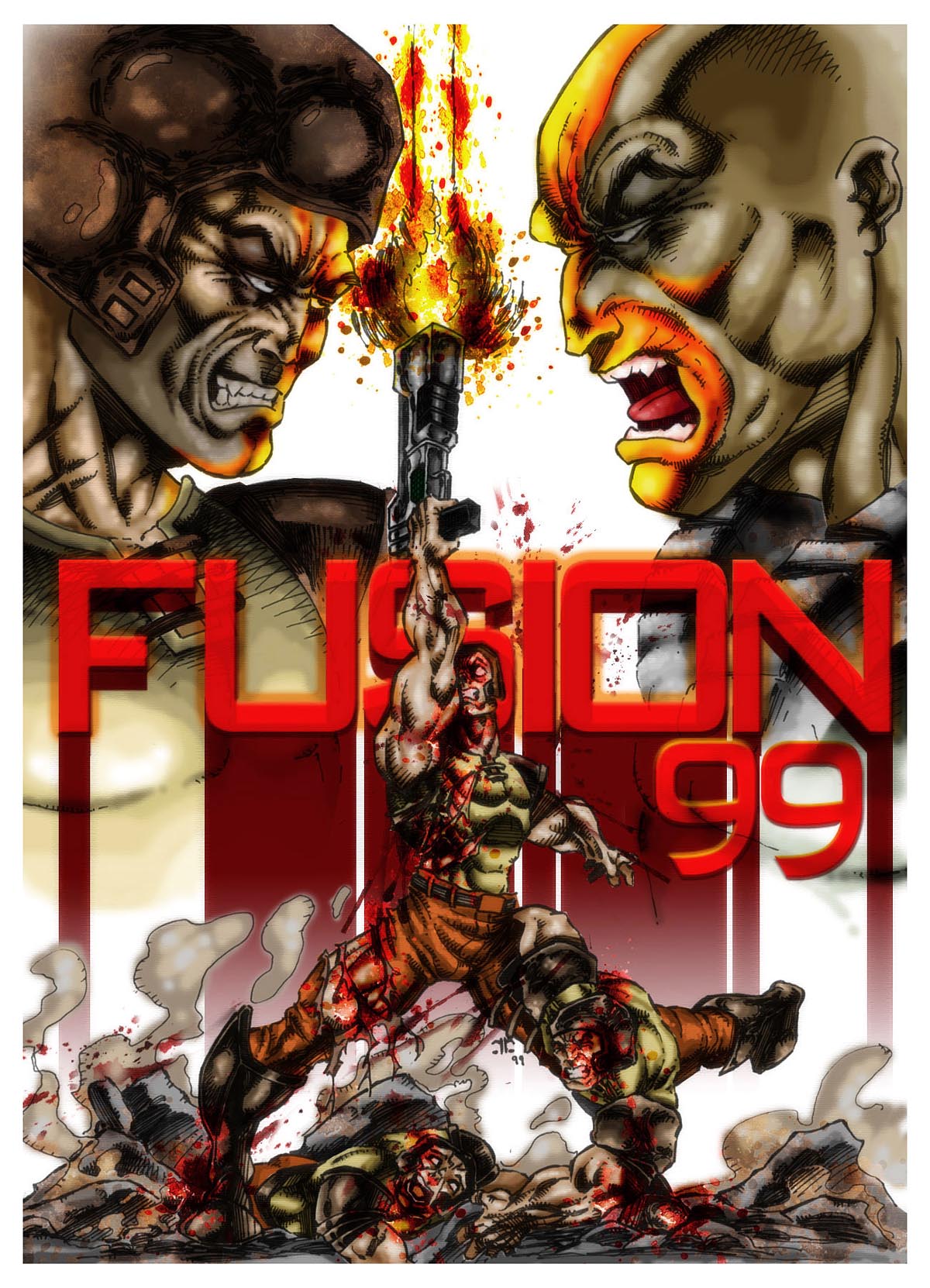
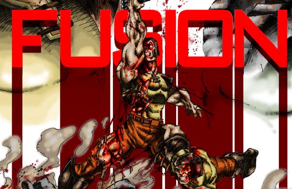
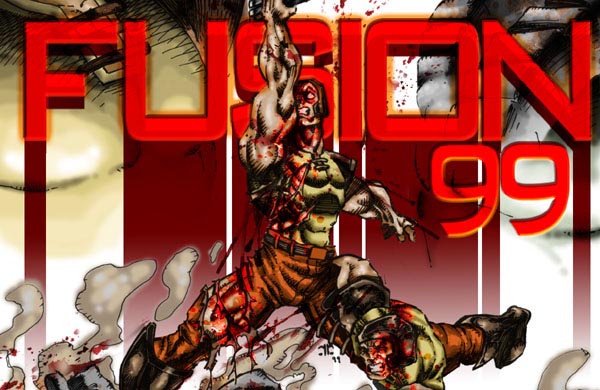
A 'HOW TO' on Fusion War

Lo all, hope your sitting comfortably cos I plan on yapping on for a while :)

The first stage for me like most when doing this type of art is to start on paper. The difference being that I tend to do a lot more work on paper than most, i start in pencil and work like a comic artist showing all the strokes that i intend to be shown in ink and mark out teh black areas with 'x' so i know to ink that black when i move to the pen and ink stage.

I tend to take a lot of time on this. I do not however plan its composition, i think this shows as composition is my weak point. I'm lazy....

I spent about maybe 5 hours on the paper stage of this piece, (pencils and inks). I use a 2H pencil and generally rely on FIBER TIPPED pens to ink it cos its quicker and cleaner than geting out the paintbrushes and I also enjoy going crazy with crosshatching. But eventually i have to stop or I ruin it. So when I stop (a picture is never finished we just decide to stop eventually for one reason or another), I scan the inked picture into the the PC at about 3 times its original size so that i have a 1500pixels wide image.

Working larger and then shrinking allows me to be sloppy at the PC stage, unlike the paper stage where no room for error (tho you can correct in PC I'm used to working neatly on paper as thats how i worked before pc colouring).

Be warned, this requires a hefty pc and amount of ram later on...


Stage 2 - The Slow boring bit...

I hate this part of the process but its essential for makign later stages tidy and quick. I mask off all the major colour/ material groups.

Since its quake guys I masked the following groups :

Shirts
Pants
Skintones
Rocks

Then I fill each section with a base colour on a MULTIPLY layer as you can see to the right of this. Its a time consuming process to get it correct in the case of areas like the leg and chests torn clothing areas etc

I should have masked the dust clouds but i got lazy again and left them till later..


Stage 3 - The Fun bit

Yup, fun time.

I CTRL+SELECT the layer I want to work on, CTRL+H to make the masked selection invisible (its a distraction) and I begin paintbrushing the shades and tones on the MULTIPLY layer I have made of each section.

I usually start on the face as you can see here, the quake guy has had the most most work done on him so far.

At this stage also I sometimes take other custom textures Ive made by photographing decayed metal (for example) and overlaying them by copying them and using PASTE INTO (the masked selection I want).

This is how I made the Quakeguy's helmet in the topleft look nicely shaded and schuffed. Its how I achieve realism in some of my skin/textures btw...

The way I make a custom texture from a photograph is by taking the best area of it, and makeing it repeat by usuing the CLONE brush and also the OFFSET filter to test it until the repeat is unnoticable.


Stage 4 - Oh you dirty bugger..

This is another fun thing to do and VERY enjoyable to me.

A lot of people do this type of art. But I always find that this bright and colourfull style makes me wretch. Its too clean to my mind so eventually I have to make my work a little dirty (and I know it likes it dirty<G>).

This 'Muddying' of my work is done by a couple of different ways..

Blood:

I made some blood textures a long time ago by taking ink and dropping blobs on white paper, sometimes its good to wrinkle the paper. I scanned the most interesting and realistic splats that looked like they might be erupting from a bullet wound or had been splattered up against a wall.
Put a bunch of them on a large PSD (photoshop image) on different layer and its handy to be able to click select the splat you want and drag it over your work.

Anyway, I mostly used 3 different settings of blood overlay. SOFTLIGHT, COLOUR and MULTIPLY groups of overlays and before long yonder quakeguy in the middle looks like hes REALLY been thru the wars..

Tints:

Usuing the blood textures again I changed their colour and used SOFTLIGHT and HUE/ SATURATION overlays to make the rocks and metallic areas look a little more realistic.

HUE SATURATION:

Fine tuning is very important. So I alter various layers when they are finished, you can clearly see ive made the skin tones more olive in general, gave some stubble to the quakeguy and reddened or darkened the eye areas on each..

Added the clouds.


Stage 5 - The Logo

Left this too late, should have put it in at start or planned it, as I did not I had to bodge this one by stretching and skewing the font I used so it was readable behind the quakeguy in middle as i couldnt put it over him without ruining the image

Thanks to making everything on seperate layer (told you that was important earlier) I was able to cut away the shape of the quakeguy and dust clouds etc from the logo very easily.

Which lookds nice with the red streak running down, but abrupt and crappy near the bottom of the red streaks.

Plus its still too matte and bland..


Stage 6 - The Logo Correct

I select the logo layer and used its mask to cut away all the colours and overlays underneath its area.

I mask select the dark red streaj and apply a gradient fade out to it and make the light red an OVERLAY layer and apply layer effect BEVEL AND EMBOSS , INNER GLOW and OUTERGLOW.

Likewise I do BEVEL AN EMBOSS layer effect on the '99'

and thats my baby complete and ready to roll after a couple extra touches and tweaks with HUE and SATURATION and a faded Underpainting filter (the only filter used in whole process) over the flattened version below.

It gives things a nice textured quality ina subtle way so as not to overpower or destroy the work i did in ink and in colour.
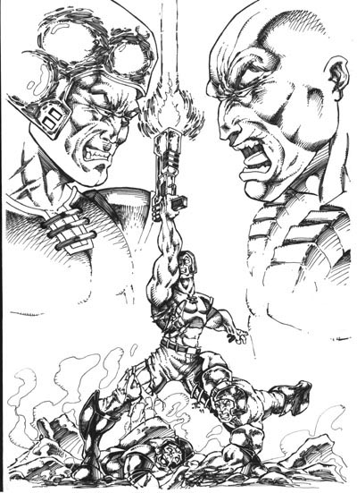
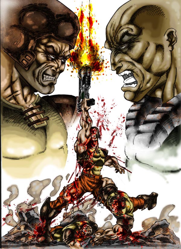
I use a mouse,pencils,pens,scanner,camera for my work.

One day I will get a graphics tablet so I can speed up.

This piece took about 12-15 hours unfortunatly..

To Sum up. I think Prepartion and knowledge of the quick way to do things is vital to producing such images. Imagination is helpfull but a boffin can fake imagination <G>


'Patience is a Virtue, and Artists are lazy people